Many cities have Open Data pages. But once you download the data, what can you do with it? This is my sixth in a series of blog posts where I download public data about Cary, NC, and demonstrate how you might analyze that type of data (for Cary, or any city!)
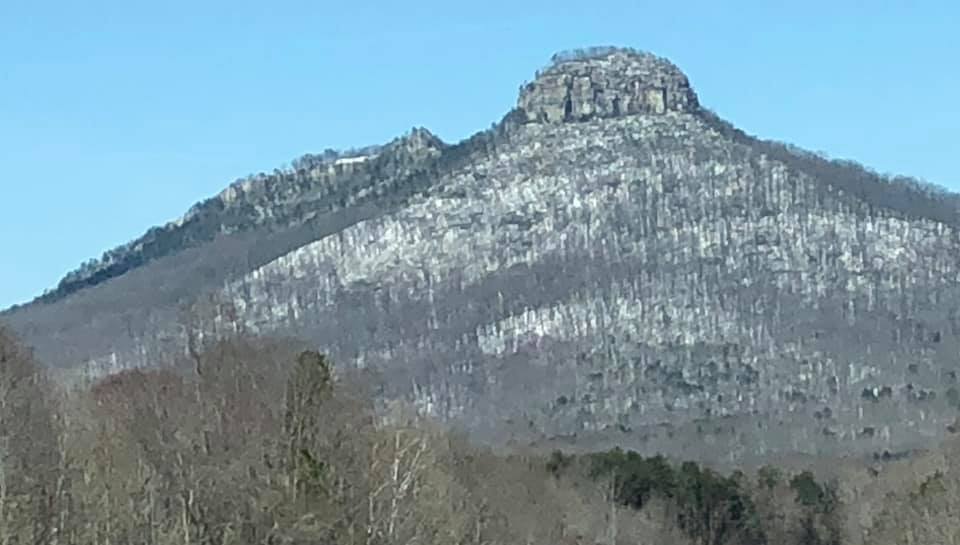
And what data did I choose this time? Well, here's a hint in the form of a photograph. Pilot Mountain is one of the famous natural landmarks in North Carolina, and my friend David took the photo when the leaves were off the trees, and snow was on the ground. David loves to drive around and see the sights when it snows!
The Data
If you guessed "snowfall data" then you are close - I'm analyzing "weather data" this time! I went to Cary's weather data page, and downloaded the csv file. I imported the text data into SAS, and found it contained daily values for many weather measurements (such as wind, rain, snow, hail, fog, etc). I then picked several of the variables to graph ...
Temperature
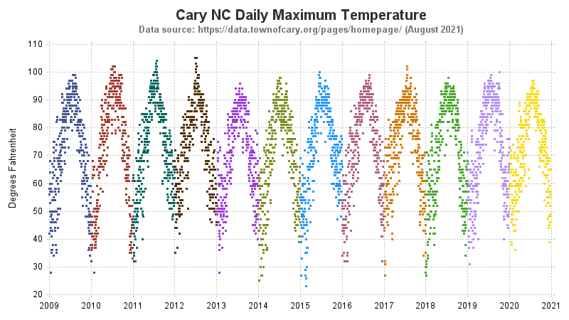
Here in North Carolina, it gets pretty hot in the summer. And we like to know "How hot was it?!?" so we can complain about it ... or brag about it. Therefore it's only natural that my first graph shows the daily high temperature. I created a simple graph, plotting the daily values along a time line, and coloring them by year. I was a bit surprised that the temperature only went above 100 degrees a few times in the 12 years of available data (Why, that's barely enough to brag about!)
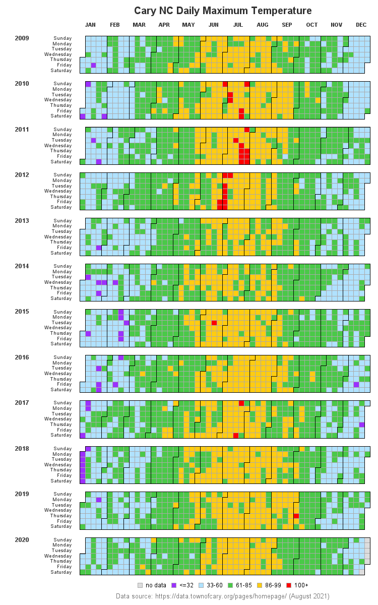
The simple graph (above) gives me a good general idea of the temperature values, but I wanted to dig in a little deeper. Instead of coloring the graph by year, I wanted the colors to help me easily see which days the temperature was over 100 (and so on). I also wanted to see the data physically arranged to more easily visualize the values seasonally. I decided to use a calendar chart - the red days have a 100+ degree high temperature (and the purple boxes have a high temperature that's below freezing, etc). Looks like most of our 100+ degree days were in years 2010-2012.
Wind
Besides temperature, the weather that affects me the most is wind. I paddle ultra-light racing boats a couple of times a week, and the wind can really affect my paddling. If I have a strong headwind, then it's more difficult to paddle, and my speed is reduced. The wind can also produce waves and choppy water, which are more difficult to paddle through. Therefore I thought it might be interesting to create a plot of the wind speed.
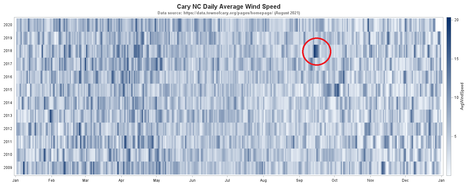
This time, I used a heatmap with gradient shading, rather than a calendar chart with discrete colors. I think the gradient shading is more natural for the wind data, since I don't have any specific values I'm looking for (such as the "below freezing" and "above 100" in the temperature data).
In general, the graph seems to show that it is less windy in the summer months. Do you know what the dark blue patch (circled below) in September 2018 represents? That was the wind from Hurricane Florence, which slowly made its way across North Carolina over several days.
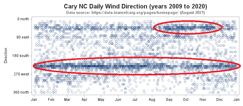
In addition to the wind speed, I was also curious about the wind direction. When I'm paddling in Cary's Lake Crabtree, the wind seems to usually come from the southwest. The following plot seems to corroborate what I've observed. In the fall, the graph shows a good bit of wind from the northeast (I'll pay close attention when I paddle this fall, to see if that seems true!)
Hail
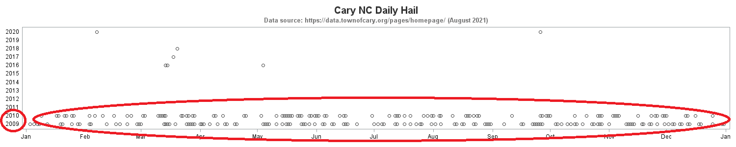
Any time there's a hail storm, the roofers seem to tell everyone they have roof damage, and need their shingles replaced (is that legitimate, or is it a scam?) Whatever the case, I thought it would be interesting to see how many times we've had hail in Cary.
In recent years, the data says we've only had hail a few times. But (very) surprisingly, the data indicates we had hail several times a month in 2009 and 2010. I'm thinking that data is probably incorrect, and needs more checking and verification! (This shows, once again, the value of graphing the data to help check for errors!)
Code
If you're a programmer, you might be interested in seeing the code (perhaps you can adapt it to analyze similar data for your area). Here are my complete SAS jobs for: temperature, wind, and hail.
Most of the code is fairly simple/straightforward, except for the calendar chart - that's a custom chart I created by defining a polygon for each calendar day, and then annotating the month outlines and all the text labels.
And if you made it this far, I invite you to share your favorite "How hot was it? ... It was so hot ..." (or other weather related) joke in the comments section below! 🙂

3 Comments
It is interesting to see that the runways at RDU are lined up exactly with the prevalent wind direction: 50 (or 230) degrees. Of course, they were built that way, but I didn't expect that the data over 10 years would have such consistent spikes.
BTW, the calendar heatmap looks great.
Interesting observation!
YYDS "Chinese: Eternal god"